Image / 7
The 2017 Chevrolet Bolt EV is an amazing, long-range electric vehicle that won multiple awards for good reason.
Driving the EV for an extended test for the first time, it’s obvious this is the future of driving. (Tesla CEO Elon Musk recently predicted that 50 percent of new cars will be electric in 10 years.)
Beyond the surprising acceleration, the spirited feel around corners (possibly because the car feels so light), and the ability to drive 238 miles on one charge, the features that amazed me were all related to the touchscreen interface
I drove the Bolt EV at the Consumer Electronics Show in Las Vegas a few months ago, and I wasn’t quite as impressed. Back then, Chevy had not fine-tuned the electric motor, and it wasn’t as sporty.
I remember thinking the interface was unique, but I kept wondering if the sluggish speed (compared to a few other electrics) would be an issue.
Driving on the curvy roads north of San Francisco, however, it became obvious the car was ready for production.

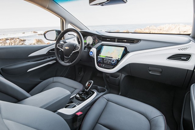
2017 Chevrolet Bolt EV
You have to hold on tight when you punch it, which seems counterintuitive in a small hatchback like this.
Then you start using the display and it feels more like an iPad. What’s going on?
The touchscreen feels responsive and doesn’t distract you from the road like a few other touchscreens in cars that have a lag.
Along the top, there’s an obvious home button, one for apps, and one for music. You can customize the layout, colors, and look and feel to one that matches your tastes and driving style.

2017 Chevrolet Bolt EV, road test, California coastline, Sep 2016
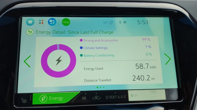
For example, the “eco” layout, shown below, includes information about the energy used.
You can further edit the screen by locating the boxes — similar to the tile interface in Windows 10 — in a different pattern or making a “tile” full-screen.
The color scheme Chevy uses made it easy to spot different sections of the UI. I never had to hunt around for the bright blue track control icons.
When I wanted to change how the EV was drawing power, I found that section easily without having to click on smaller icons (as is the case with many other cars).
![Chevrolet Bolt EV drives 300 miles [Screenshot from video by owner Glenn Williams] Chevrolet Bolt EV drives 300 miles [Screenshot from video by owner Glenn Williams]](http://images.hgmsites.net/med/chevrolet-bolt-ev-drives-300-miles-screenshot-from-video-by-owner-glenn-williams_100593149_m.jpg)
Chevrolet Bolt EV drives 300 miles [Screenshot from video by owner Glenn Williams]
Someone at Chevy deserves credit because they obviously tested the interface with actual drivers—who have actual fingers.
Instead of having to fine-press on an icon, you can click anywhere in the tile.
That meant, even on rocky terrain as the car was moving around a bit on the road, I was still able to make selections.
Having a clear interface helps with distracted driving problems. You can easily make selections without having to tap-tap-tap on the buttons as you look at the screen for too long.
The UI is one of the best I’ve seen in any recent car, and I’m including a test drive in a Tesla in that comment.


No comments:
Post a Comment